By clicking “Accept”, you agree to the storing of cookies on your device to enhance site navigation, analyze site usage, and assist in our marketing efforts. View our Privacy Policy for more information.
50 Ways to Increase Ecommerce Conversion Rates on Shopify
In the world of ecommerce websites, a conversion takes place when a visitor completes a purchase, which typically includes entering in shipping and payment information and then receiving confirmation of the order.
There are numerous factors that can influence a visitor to complete a purchase on a website. Any efforts to increase the rate at which visitors become paying customers can be considered conversion rate optimization (CRO).
Below are ideas and tactics that may improve conversion rates on your ecommerce website. Since we at Barrel work with brands selling on Shopify’s ecommerce platform, we’ve added some Shopify-specific ideas as well.
Your mileage may vary for each of these and it’s best to use analytics and a testing plan to methodically and coherently optimize your website. In other words, don’t pick ideas at random, implement them, and pray that they’ll work. Let observations of your website’s data and visitor behavior guide your thinking on which ideas would make most sense to try out and what you hope to learn from testing them.
Now, let’s dive in.
Make the website load faster: this is a complex topic of its own, but the oversimplified version is this: conversion rates go up when people don’t have to wait long for the site to load. Compress image sizes, minimize the code, use performance software like Yottaa and Layer0, or embrace headless to get websites to load faster.
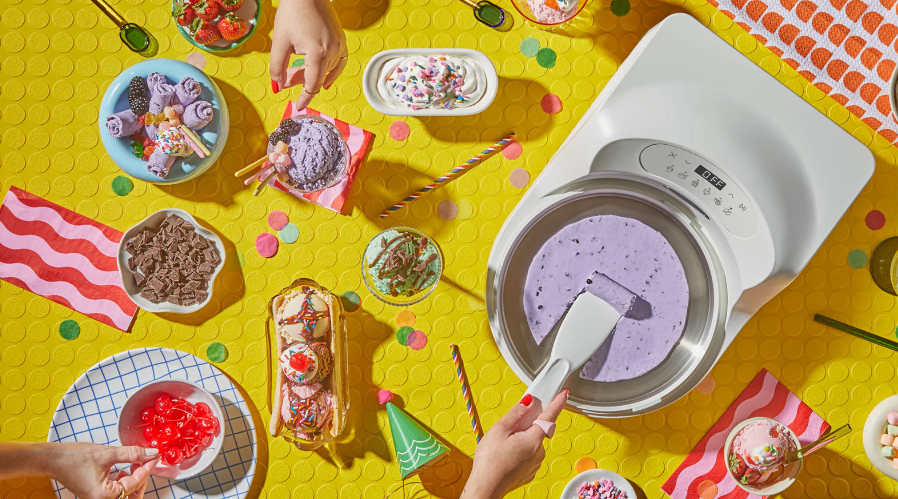
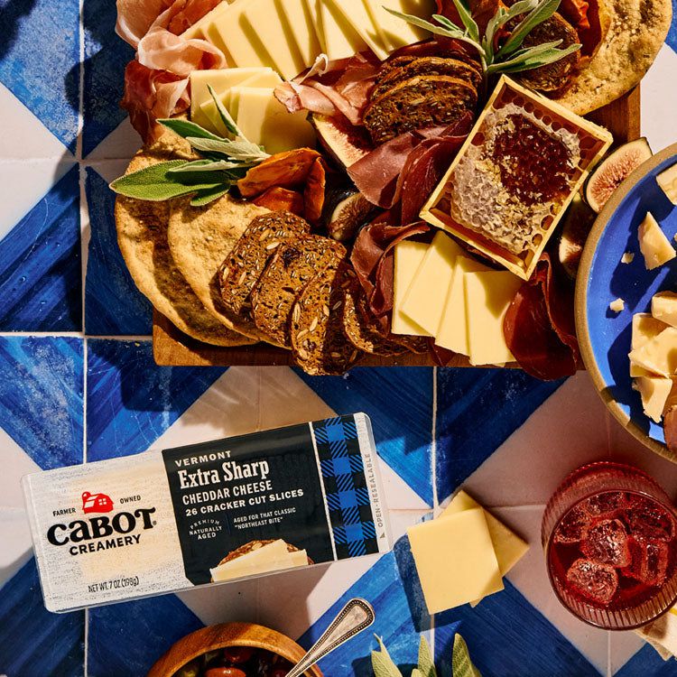
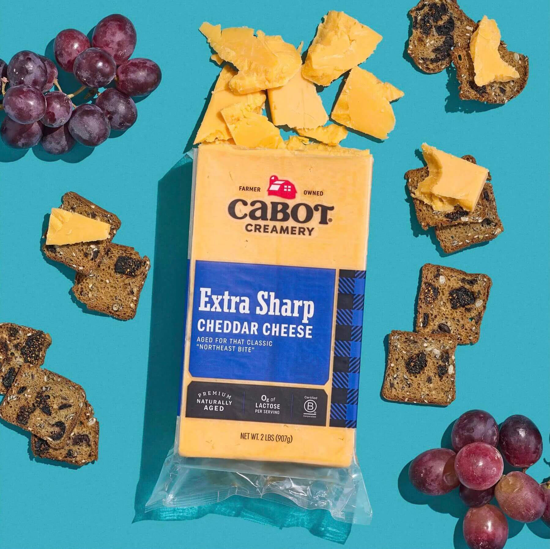
Upgrade product photography: having high quality pictures of the product from multiple angles with great lighting and some "in-use" or "on model" variations will go a long way in helping visitors feel more comfortable with the idea of owning the product.
Enable accelerated payments such as Shop Pay, Apple Pay, PayPal, and Google Checkout: accelerated payments allow visitors to use stored credit cards and shipping information to quickly check out, often in a few taps on their phones.
Offer a discount code to first-time purchasers: incentivizing first-time customers with savings is a time-tested method for conversions, although it may not be appropriate for all brands, especially those trying to preserve a certain aura around pricing.
Invest in videos of the product: videos can go a step further in helping visitors imagine what ownership can be like, especially through in-depth walkthroughs and "how to" content that help them understand some of the details that are not readily apparent from static photos and text descriptions.
Lovevery uses video in their product detail page to describe the whats and the whys of each item within their toy subscription boxes, carefully explaining how each can be used.
Properly track analytics and ensure conversions are being counted: leverage software like Elevar to ensure Google Analytics and Google Tag Manager are playing well with Shopify. Conversion rates can be affected by what is not counted.
Highlight customer reviews across the website: cherry-picking and showcasing the best customer reviews on the homepage, landing page, and elsewhere can be good social proof markers that help visitors feel more comfortable about buying.
Showcase user generated content (UGC) from customers' social posts: you can leverage tools like Pixlee or Foursixty to show customers who have taken photos or made videos about the product and curate them across the website. These very visual UGC works as social proof and also helps visitors see how the product looks and works in real life settings.
Tweak the website copy: taking some time to edit headlines, product descriptions, and other copy in order to clearly articulate the brand and each product's value proposition can be very impactful for conversions. Reference old classics for copywriting techniques to hit on the emotions of visitors and influence them towards purchase.
Surface bestsellers: make it easy for visitors to decide on a product by showcasing the most popular or bestselling products prominently on the homepage and other areas of the site (e.g. bottom of every product detail page).
Specially curated collections: test out having collections that are specially themed or curated and displayed in interesting ways in order to help visitors decide more quickly. For example, a beauty site selling dozens of products might feature "Our Founder's Daily Essentials" that lists 5 specially curated SKUs.
Create a "Gifts" collection: for brands in certain categories, having a dedicated "Gifts" collection can help with conversions especially if the products are suitable gift items.
Brightland created a dedicated gift guide page linked in their navigation that showcases their gift bundles, organizing them by price categories.
Improve the search functionality: having search features like auto suggest or richer search results pages can help visitors find what they're looking for. With tools/software like Findify, Searchspring, and Algolia, you can provide more accurate results and learn from customer behavior by digging into search analytics.
Upgrade lifestyle photography across the website: in addition to product photos, featuring imagery of the aspirational lifestyle in which the product might be used can be a great way to project a brand story that appeals to visitors. An example might be an apparel brand that is about being active and getting outdoors for adventure–great lifestyle photography in this case may feature models wearing the clothing in exotic locations having a great time.
Lo & Son’s product detail page takes on an Instagram-like feel, serving up a photo gallery highlighting different lifestyle and product shots with different colors, sizes, and aesthetics.
Add detailed touches & elements: depending on the audience, some visitors are moved by what they perceive as a "brand personality" that comes through the website experience. These may include illustrations, graphic patterns, special icons, and animations that create a "vibe" to resonate with potential customers.
Free shipping: offering a general free shipping benefit (provided the unit economics allows for it) or free shipping for clearing some kind of order hurdler (e.g. spend $50 or more and get free shipping) can increase conversion rates. The presence of what looks like a high shipping cost can be a de-motivator for visitors at checkout.
More customer reviews: increase the number of reviews for your products by offering incentives for your customers (e.g. here’s 10% off your next purchase). More reviews lends to more credibility, which leads to more conversions.
Many brands use loyalty points in exchange for more reviews, and Fabletics customers can earn rewards for sharing reviews to earn additional rewards and benefits.
Clear returns policy: feature a clear and easy-to-find returns policy with a clear link in footer and also a call-out on product detail page. Leverage software services like Loop Returns or Happy Returns to offer more seamless returns experience.
Live chat / customer service widget: install a customer service widget (staffed properly by your team) to allow customers to ping questions to clear their path to purchase. Log common questions and feature these in an FAQ section and also work them into copy across the site.
Free gift with purchase: one way to make the cart more appealing and therefore more likely for the visitor to move on to checkout, is to show that a free gift is included with purchase. Examples of a free gift we've seen are: sampler size items of popular products or SKUs with slow velocity that may be better served by being given away. As with any discounting or "free" tactics, the brand has to be good on the unit economics and make sure each transaction doesn't leave them in a huge hole and that there's enough margin or some kind of payback that's possible.
Once customers hit a certain dollar threshold in their Milk Bar cart, they can also receive a free, reusable Gift Assorted Cookie Tin.
Buy one get one: for high margin, high velocity products, a buy one get one (BOGO) offer can demonstrate great value and improve conversion rates. We've seen this used on products like reusable drinking cups, beauty products, and snacks. A BOGO offer can also be a way to activate new customers into becoming ambassadors who "gift" the extra product to a friend, converting them into a customer by proxy and eventual future customer.
100% money back guarantee: an effective way to demonstrate confidence in the product and assuage any anxieties the visitor may have about buying. If you take this route, be prepared to honor it and stand by your product. Also, work out the math first to ensure your unit economics can support a certain percentage of customers that ask for their money back and how this will play out both logistically and financially.
Limited inventory message or indicator: this could be a count of items left of a certain product and displayed on the product detail page. Such a scarcity message can influence more immediate conversions.
Rowing Blazers indicates size availability on items lower in stock with an inventory countdown on their product detail pages.
Browse abandonment emails: made possible by using a marketing automation / email service provider like Klaviyo, you can track visitors who’ve come to the site through an email link and trigger a “come back and finish shopping” email if they leave without buying.
Cart/checkout abandonment emails: same as above, these emails are triggered when the visitor has made it to cart or checkout and leave the site without purchasing. The emails can feature the very products that were in their carts at the time with a prominent reminder to check out. There can be subsequent emails if a purchase has not been made for a few days with later emails enticing the visitor with a discount code to really encourage a transaction.
Lou Lou and Company sends automated emails as a reminder to users who have filled up their cart, but haven’t yet completed their purchase.
3rd party abandonment emails: leveraging services provided by PayPal or SafeOpt which can track abandonment if you’re logged in or have been ID’d on a different site and send you a notification to go back and finish checking out.
Higher contrast button colors: this tactic sometimes gets laughed at because it was one of the original CRO and A/B test tactics that often got overplayed (e.g. testing endless colors) but it’s not something to completely dismiss. If your call to action element is an easily missed link or a very subtly colored button, there’s opportunity to test something that is easier to spot.
Gift messaging option on cart: allowing customers to send the purchase as a gift with a message will help gift shoppers overcome hesitation to buy for a friend.
Bomba’s ‘Make it A Gift’ pop up provides gifters the option for a custom gift message, gift wrapping, a gift box, and a gift bag.
Product filtering options: this feature is especially valuable for extensive product catalogs, giving users the ability to quickly zero in on attributes like color, style, and size can help them find a match, leading to higher conversion rates.
Visionist’s filtering functionality allows users to filter through many different categories on their product pages, including Shape, Color, and Style.
Product sorting: also relevant for more extensive product catalogs, providing a way to reorder the gridded list of products by price, name, reviews / most recommended, and even popularity can aid in discoverability.
Bundling: combining multiple products into a single item and listing at a better value than if they were all bought separately can encourage conversions, especially if the products work well together and cost less than if bought separately.
Brandless prominently features almost 50 bundle options on their site, which are offered and marked at a better value when grouped together.
Sampling: selling a much smaller and lower-priced size of a product can reduce perceived risk and allow for trial. You can also offer a sampler collection bundle as a way to help customers find the particular flavor/variant they like before they commit to a larger version.
Buy now pay later (BNPL): these financed payment options can appeal for certain products and buyers who find these financing options appealing for their buying needs and help convert them. Examples are Affirm (Shopify’s 4-payment installation is powered by them), Klarna, and AfterPay.
Email sign up forms: especially if they offer a compelling incentive or attractive content, help capture emails that can then be remarketed to later via email campaigns, which can bring back visitors for conversion. This is why email can be one of the highest converting channels.
Landing pages: having well-designed landing pages that match ad campaign messaging and visuals can aid in conversions.
Social ad creative: running better ad creative on platforms like Facebook/Instagram and TikTok will lead to warmer traffic that’s primed to buy. The more effective the initial ad, the higher chance the visitor will convert.
On-page SEO: improving on-page search engine optimization (e.g. page load speed, structure, titles, keywords, etc.) can lead to better search engine results page (SERP) rankings, which then leads to more relevant, ready-to-buy traffic that will boost conversion rates.
YouTube influencer content: YouTube is one of the largest search engines in the world and is a pitstop for many who are doing research on a product before buying. By seeding influencers and getting both objective and sponsored reviews, you can increase exposure on YouTube and bring traffic that’s already convinced of the product’s superiority and ready to buy. Increase this kind of traffic and conversion rates will rise.
Mobile UX: tightening up your website’s mobile experience, including shortening the scroll depth and putting more content above the fold. Using a tool like HotJar can help see scroll depth reports and heat maps that give insights into how people are browsing the site.
Retargeting ads: run via Facebook/IG and display ad platforms, these ads “follow” people around to their social networks and favorite websites as reminders to complete their purchase and usually have the high conversion rates for traffic coming back to the site this way.
Recent sales pop-up widget: install a Shopify app that shows alerts of other people who’ve purchased something on the website, which creates a sense of social proof and urgency. These are the bottom-left notifications that show alerts like, "Bob from Topeka, Kansas just bought Adventure Backpack for $49."
Extensive knowledge base and support content: investing in this type of content can give visitors the confidence that there is robust documentation and resources for the product they are buying. This is especially relevant for more complex products that require guidance.
Press reviews: through PR and relationships with editors and writers, getting featured by known entities such as Wirecutter, Vogue, or other brand media names will confer credibility and drive warmer traffic to the website.
Sustainability content: feature a page that talks about your brand’s commitment to sustainability and choices made on packaging and product materials. This can be a motivating factor for visitors who actively look for sustainability-conscious brands.
On Patagonia’s website, customers can explore the brand’s commitment to using recycled materials and giving back to the planet.
Offer free returns: visitors who are hesitant about buying due to various concerns (e.g. fit, will it work with my environment, etc.) may convert more easily if there is a free and easy returns process that’s clearly stated on the website.
Founder story content: some visitors are compelled by a relatable or inspiring founder story. Featuring a human face and story on the website can lead to additional conversions.
Users who visit The Outset can connect more deeply with the story of the brand through pages like About Us and Our Manifesto.
Shipping times: provide peace of mind to visitors who need something by a certain date by being upfront and transparent about how quickly products get fulfilled and shipped (e.g. “usually ships in 1-2 business days”). Shipping times are best to display if fulfillment times are realistically fast, as slower times (e.g. 2-3 weeks) can be a dealbreaker that cause visitors to leave the site.
Multiple address option: this feature becomes especially handy during holiday times and can boost conversion rates for shoppers who’re buying the same product or from the same brand for multiple gift recipients.
Sale countdown timer: if you are running a sale, having a countdown timer on the website (and reinforcing with periodic emails during the sale) can increase sense of urgency and encourage visitors to act quickly and make the purchase.
Badges on key products: having a high-contrast badge that indicate something special about the item such as “New”, “Bestseller”, “Most Popular”, “Limited Quantity”, “Exclusive Offer”, etc. can help visitors narrow their focus and go one step further to the product detail page and increase chances of conversion.


%20(1).jpg)