By clicking “Accept”, you agree to the storing of cookies on your device to enhance site navigation, analyze site usage, and assist in our marketing efforts. View our Privacy Policy for more information.
Barrel's Director of Strategy and Design Director hosted a live optimization session deep diving a brand who submitted their site for review, including a roadmap of fixes to implement before BFCM.
Inside the TUSHYVERSE: Designing for a Brand That’s Growing Up
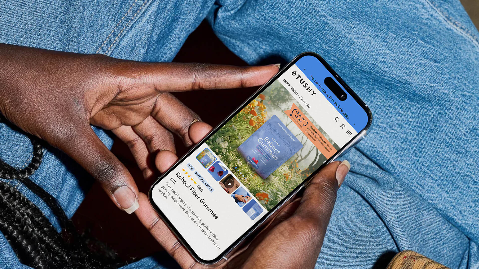
TUSHY built its name on being humorous and loud. The bidet brand made its mark with cheeky marketing and a voice the team itself describes as middle school meets high school potty humor. It worked for the audience TUSHY had at the time and established them as a leader in the bidet category. Then the brand grew its portfolio. Fiber gummies, accessories, and a smart toilet joined the lineup, and it was time for the next evolution of the brand. We partnered with TUSHY on their site redesign to help the brand mature visually without losing the personality that makes them recognizable.
A Visual Language Rooted in Nature
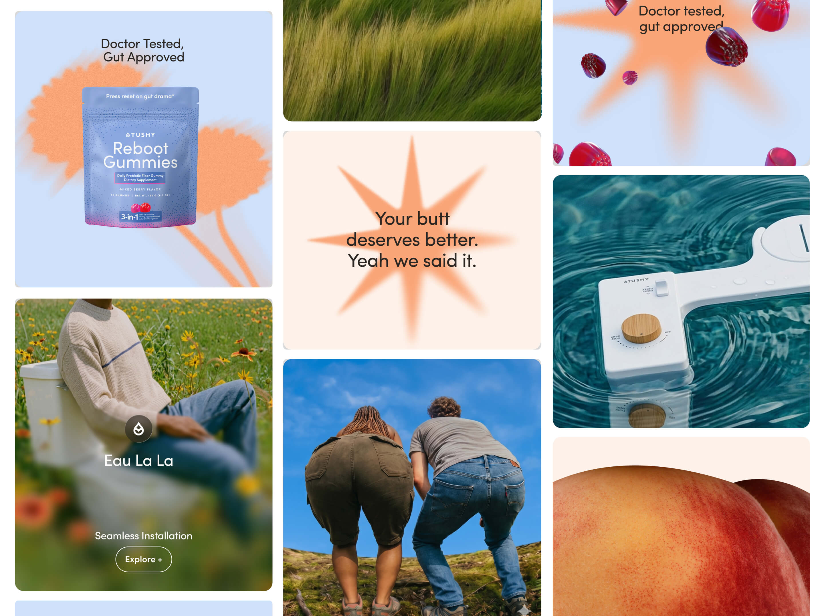
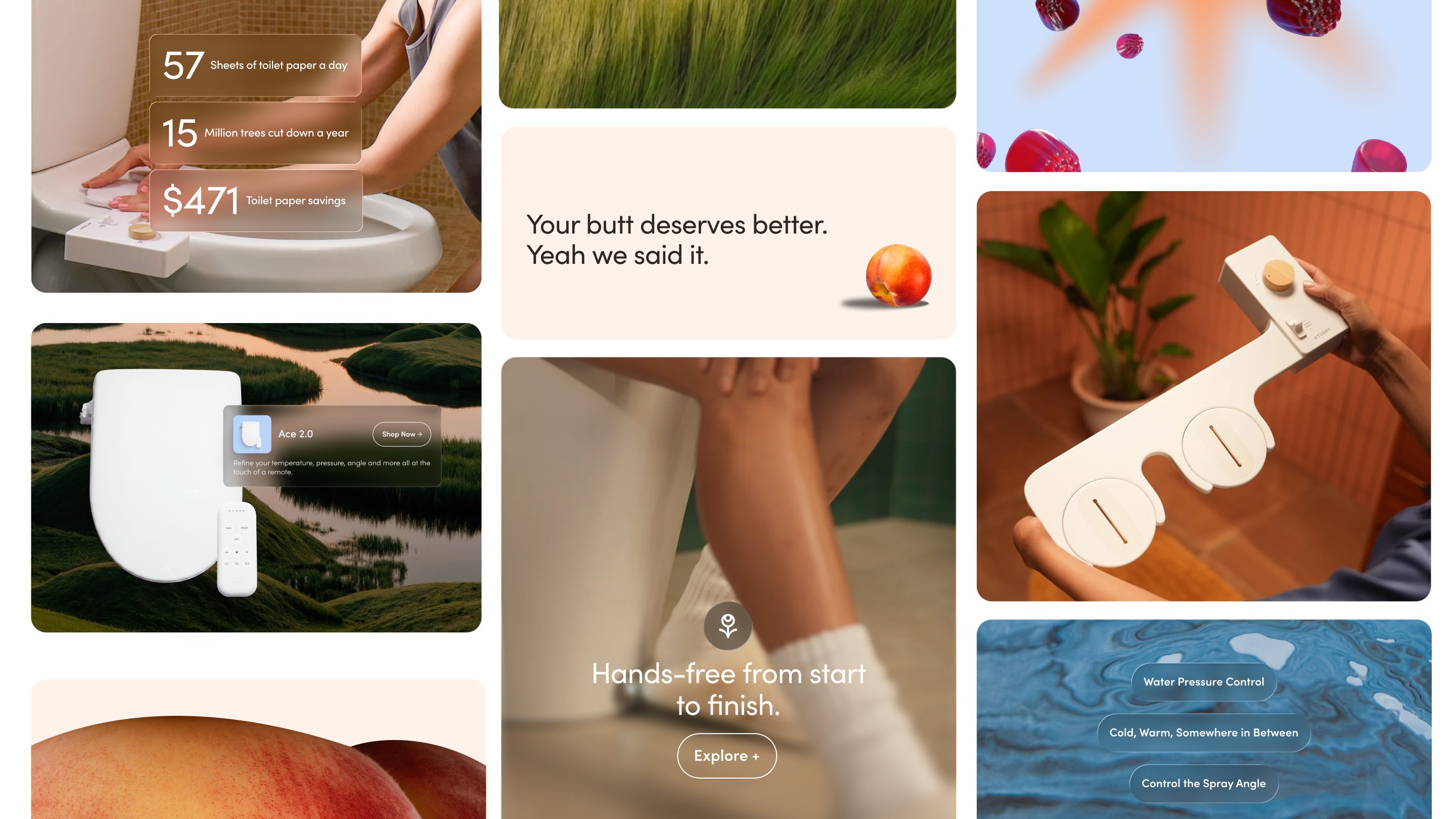
The shift started with a question about feeling. TUSHY’s strategy centers on “The Joy of Toileting,” a view of the bathroom as a calm, restorative moment rather than a clinical one. We translated that into imagery and color drawn from nature: flowing water, open sky, tall grass, and warm light. The old flat, primary-color palette gave way to a refined set of named tones: Tidal, Sky Mist, Grove, Meadow, and Honey’ed Peach. Soft rounded corners and a subtle liquid glass effect add the same gentleness to the interface itself.
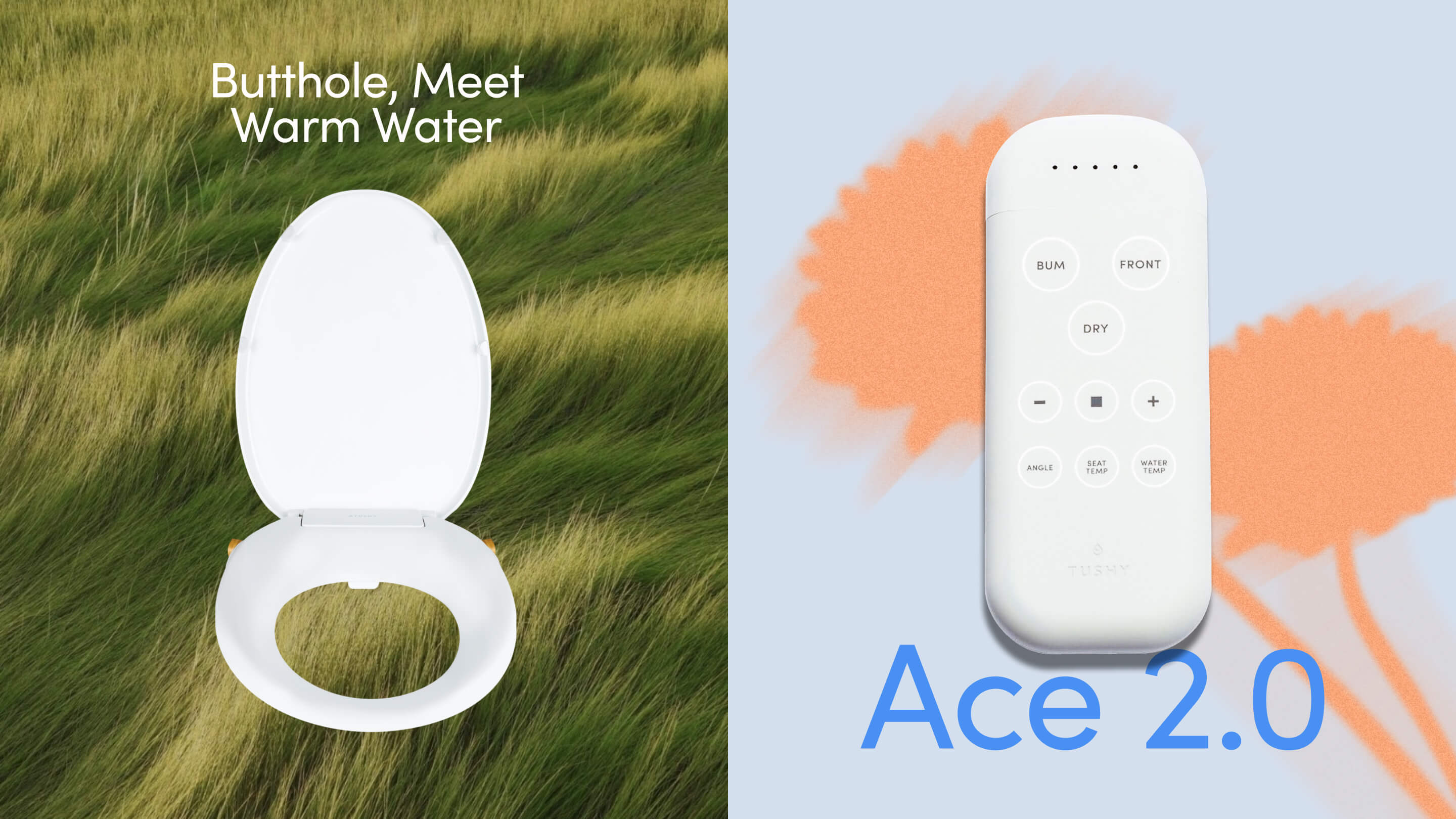
The new look also had to work across a much bigger lineup. TUSHY now sells entry-level bidets, a smart toilet, and fiber gummies, and the visual system needed to hold all of them together with one point of view. Product photography follows the same logic, taking its cues from each product’s name so a bidet seat called Wave belongs near water.
Where Wellness Tech Meets Warmth
Wellness technology brands show how this balance works. Their hardware is precise, but their sites feel human, editorial, and unhurried. We pulled from that approach and kept a technical backbone underneath the softness: structured typography, a modular page system, and clear organization that makes a large product lineup easy to scan. The ethereal look sets the mood, and the engineered layout does the work of helping people shop.
Where the Humor Lives
Humor didn’t disappear from the new site. It lives in the details, where it rewards attention. The design stays calm, with soft light, open space, and photography drawn from water, sky, and grass. TUSHY’s voice handles the jokes, in small, confident moments you find as you scroll. Homepage headlines still sound like TUSHY, and the About page gives the brand’s personality even more room to play.
Hidden Moments on the Homepage
A few of our favorite examples:
A running tally of butts. The announcement bar and hero keep count of how many people love TUSHY, now past 3M. It works as social proof and as a joke in the same breath
A joke that opens the argument. “Your butt will never be the same” leads into a sincere pitch about a bidet becoming a routine you miss when you travel
Persona tabs with a wink. The section tells visitors they’re a bidet person who doesn’t know it yet, then sorts them into groups like New Moms, Sensitive Skin, and Gut Health. Each tab pairs a short joke with a real customer review. The gut health line turns “microbiome” into a verb
Puns on the collection cards. Toilet stools get a line about getting into position, bamboo toilet paper asks you to rethink your roll, and home goods promise a smarter toilet
Names that play with water. Wave, Oasis, Cloud+, and Aura sound like a spa menu. The smart toilet, Eau, is the French word for water, a pun quiet enough that some shoppers won’t notice it
A wink in the app and newsletter. The Hindsight app section invites you to log your poop and own something familiar, and the newsletter sign-up is labeled as top toilet reading material
The humor lives in headlines, card captions, and section titles, and each joke usually leads into a clear, useful answer. Navigation labels, prices, and product details stay literal, so shoppers never have to decode a pun to find what they need.
The TUSHYVERSE: Education With a Wink
The About page is where TUSHY’s playfulness has the most room. The rest of the site works as an ecommerce experience, but the About page is a scroll experience, which means it reveals its story as visitors scroll instead of presenting fixed sections. The team nicknamed it the “TUSHYVERSE.”
A History Lesson That Normalizes the Category
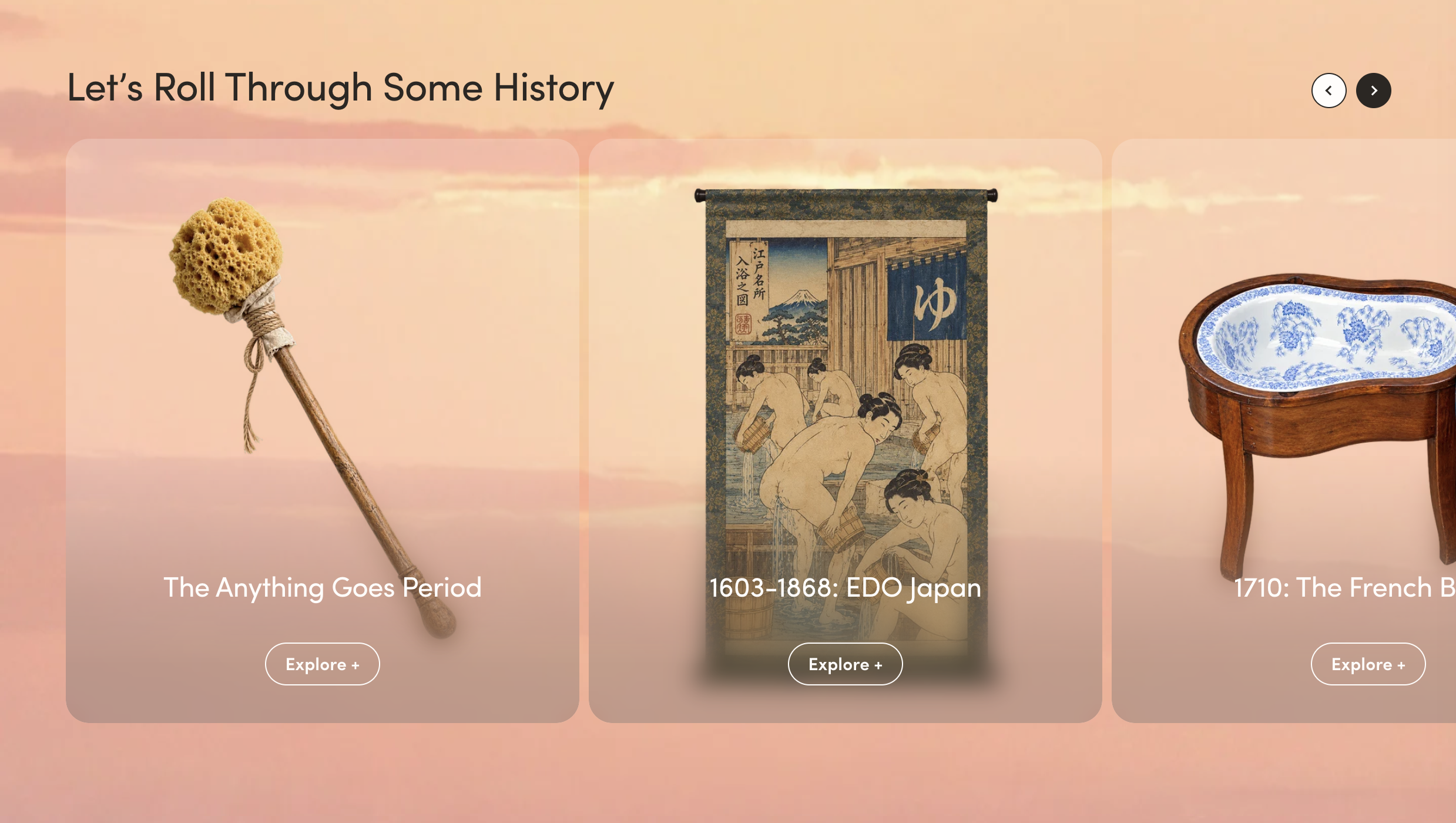
The first major section, “Let’s Roll Through Some History,” teaches while it entertains. It follows six eras of toileting. The first predates toilet paper, when people used whatever was around. From there it moves through Edo Japan’s early water cleaning, the French bidet of 1710, and the arrival of toilet paper in 1857. It then reaches the 1964 American Sitzbath, which TUSHY’s timeline credits as the modern bidet, and its export to Japan in the late 1960s after it struggled to find buyers at home. Each era is a card visitors can open for more detail.
Bidets still aren’t a standard bathroom fixture in North America, and that’s why shoppers research for months before they buy. The timeline answers the question most of them have: why doesn’t everyone here use one? It shows the bidet as a long-standing practice much of the world already knows, with the US as the outlier. The jokes stay in the section titles, and the facts stay plain and specific.
What Brands Outgrowing Their Voice Can Learn
TUSHY evolved the look and feel of its brand to align with its updated positioning, while still remaining recognizable to its loyal base of customers through its voice. The brand still says “butts” without apology. The running tally of people who love TUSHY still greets visitors. The product names still sound like TUSHY.
And around those familiar pieces, the design moved up-market. Calmer color, editorial photography, and structured typography now suit a $1,599 smart toilet as well as a $49 handheld bidet sprayer.
If your brand is growing up, start by listing the signals customers already link to you, such as a phrase, a color, or a naming habit. Protect those first, then let the imagery, layout, and typography catch up with where your products are headed.