By clicking “Accept”, you agree to the storing of cookies on your device to enhance site navigation, analyze site usage, and assist in our marketing efforts. View our Privacy Policy for more information.
Submit your site for a free live audit from Barrel's Director of Strategy and Design Director. Everyone who submits has a chance to win 1 of 5 Nintendo Switch 2s.
How Hiding Filters Helped Mack Weldon Lift Conversion Rate by 6.06%
Mack Weldon built its business on modern menswear essentials, underwear, undershirts, and everyday basics engineered with proprietary fabrics for comfort and durability. That product mix brings two different shoppers to the same product listing page (PLP): loyal customers who already know what they want and are moving quickly to restock, and new customers who are still comparing colors, fabrics, and fits for the first time. Designing navigation, filtering, and product-browsing tools that work for both audiences at once became the focus of our conversion rate optimization (CRO) testing program on Mack Weldon's PLPs.
Product Browsing Tools Sending Mixed Signals
Filters and other navigation tools look like an obvious win on any PLP. More visibility into color, fabric, and price should help shoppers find what they want, faster. But the data we had on Mack Weldon's site pointed in a few different directions at once.
The sticky filter bar extended below the fold on desktop, so options like color, fabric, and price were effectively out of view, a navigation problem that could be limiting how efficiently shoppers refine results. At the same time, behavioral data showed that new users, who made up most of the site's traffic, rarely touched the filters that were there in the first place. And separately from filtering altogether, the Quick Add experience, the tool that lets a shopper pick a size and add to cart without ever leaving the PLP, raised its own question about whether the current design was making that interaction easier or harder.
Three separate signals, three separate hypotheses. Rather than treat the PLP as a single problem with a single fix, we tested each one.
Three Tests Across Navigation, Browsing, and Add to Cart
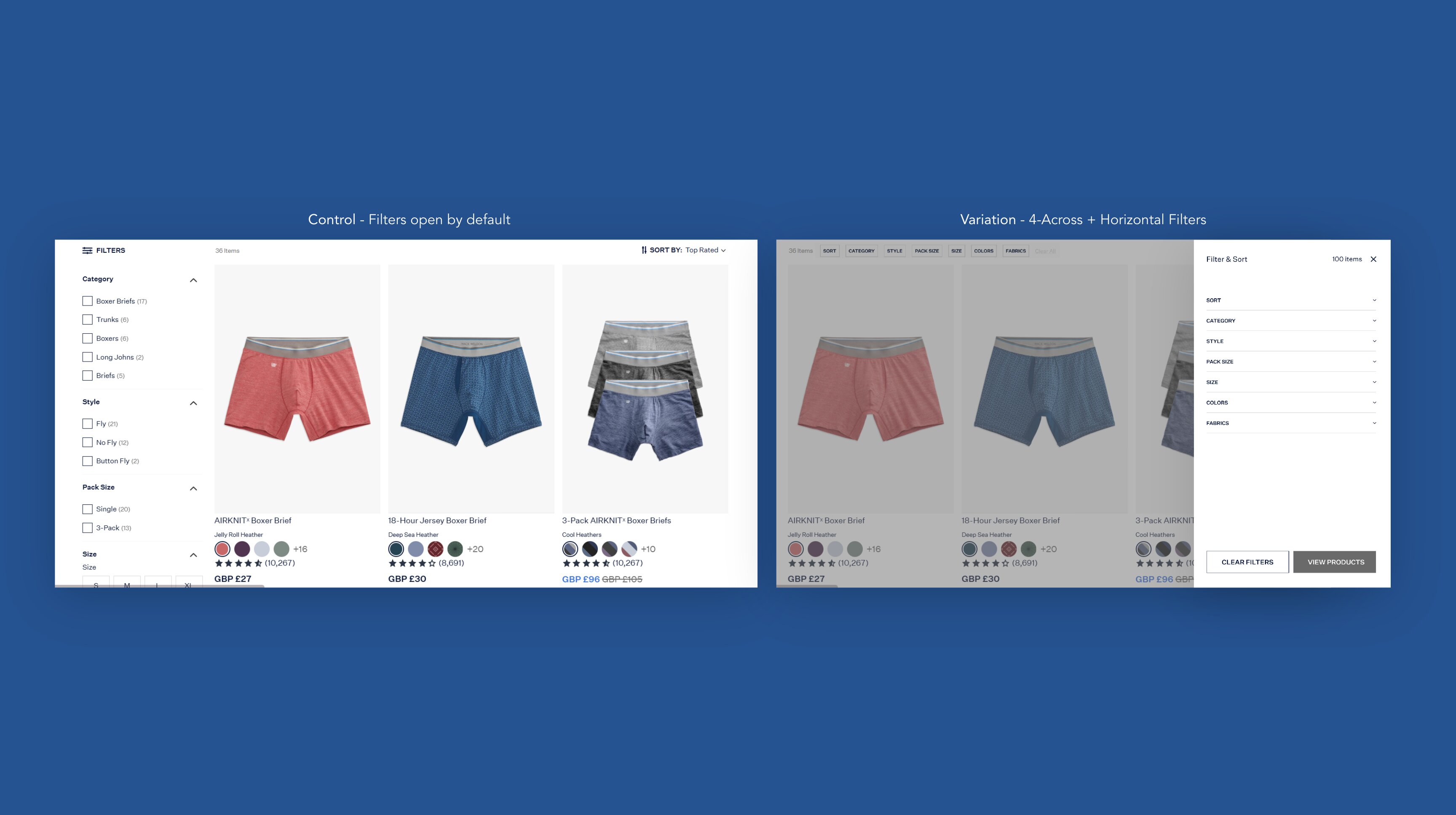
Making every filter visible. We moved filters into a horizontal bar that opened a full sidebar, put all options within the viewport, and switched the grid to 4 products per row instead of 3
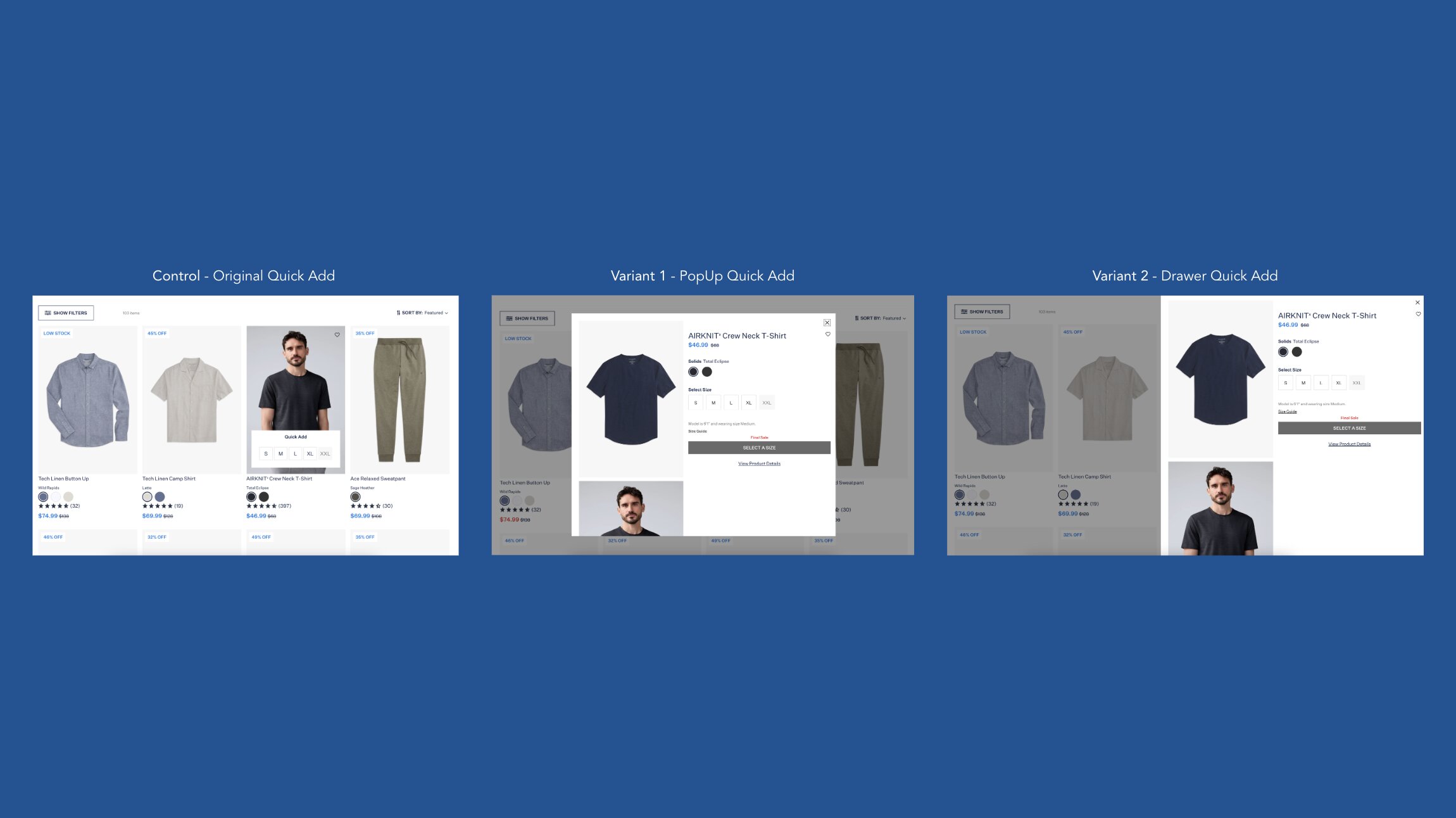
Rethinking Quick Add. We compared three formats, tile, pop-up, and drawer, for how easily a shopper could select a size and add to cart directly from the PLP
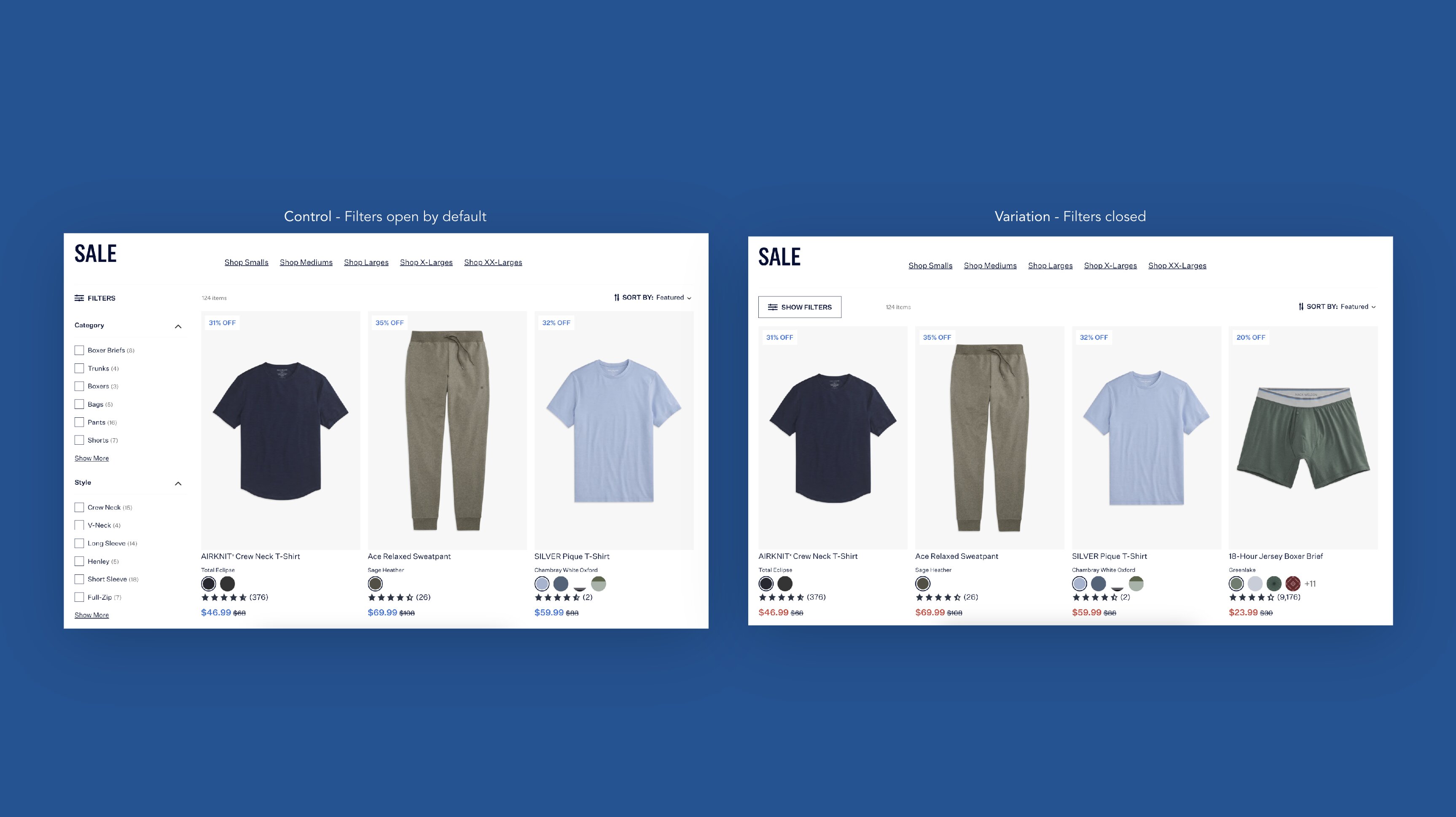
Hiding filters by default. We took the opposite approach from the first test: hide filters, show 4 products per row, and see whether shoppers engaged with filters when they had to actively open them
Running three related but distinct hypotheses across the same page gave us a fuller picture of how navigation and browsing tools were actually shaping conversion, rather than treating the PLP as one problem with one fix.
The Win Came From Removing, Not Adding
Making filters more visible lost. It reduced filter usage overall and lowered purchase value among returning users, resulting in a net revenue loss. The Quick Add test came back inconclusive: the pop-up version showed promising signals on revenue and CVR, but add-to-cart activity dropped.
Hiding filters by default won, and won clearly. It drove a 6.06% lift in CVR at 93.9% significance, with directional gains in add-to-cart as well. PDP (product detail page) visits stayed flat, which told us something specific: shoppers weren't browsing more pages, they were converting more efficiently on the ones they saw.
With the site seeing roughly 753K sessions a month, even a conservative share of that PLP traffic converting at a higher rate adds up to a meaningful number of incremental conversions every month, without any additional spend on traffic or promotions.
The results also sharpened what we tested next. Mack Weldon is now rolling out hidden filters across desktop PLPs and testing new formats, like exposing filters after scroll, on additional pages. The first test's loss is part of what led directly to the third test's win: a reminder that CRO programs build on each other, even when individual tests don't land the way you'd expect.
Want to see how a structured testing program could uncover wins like this on your site? Get in touch to talk through a conversion rate optimization program for your brand.






.jpg)