Black Friday Cyber Monday (BFCM) is the highest-traffic stretch of the year for many brands, and most of that traffic arrives on a phone. The majority of brand operators work on laptops, which naturally leads them to primarily review their own sites on a desktop. That gap lets mobile friction points, like a vague button, a buried help link, or a missing payment option, slip through and cost conversions when shoppers are most ready to buy.
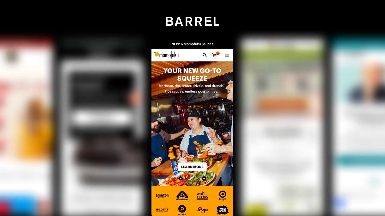
On September 23rd, Barrel's Director of Strategy Val Geisler and Design Director Christine Carforo hosted a live user experience (UX) and conversion rate optimization (CRO) audit. We received 82 brand submissions and narrowed them to five finalists. Val and Christine then walked through Momofuku's mobile experience from homepage to post-purchase, using a condensed version of the audit process we run for our clients. Below are the most actionable takeaways. If you prefer to watch, you can access the free recording of the full audit.
The takeaways
01 | Give homepage visitors a reason to start shopping
Momofuku's homepage gets a lot right. Recipes, reviews, brand content, and an email signup all appear as you scroll. The first call to action (CTA), though, reads "Learn More," even though it leads to a shoppable page. Christine recommended making "Shop Now" the primary hero button and moving any learn-more content to a secondary button style.
Christine also flagged a range problem. Many shoppers know Momofuku from a single product at their grocery store. "I don't even know how many products they have because I only have noodles at my local grocery store," she said.
The homepage doesn't show product categories, so first-time visitors can't see the brand's breadth. Surfacing categories and more products throughout the page lets new customers discover the full line and shop in context.
02 | Make sure every email opt-in delivers on its promise
Momofuku runs several opt-ins: a full-screen email takeover (a format that we’ve seen consistently perform well), a separate text message (SMS) popup, and an embedded signup in the footer. Val, a retention marketer by trade, tested them and found gaps. The footer signup promised a free incentive that never arrived, and no welcome flow followed. When she completed the popup, she shared her flavor profile preferences but couldn't tell how that information was used.
Footer forms get less quality assurance attention than popups, so they tend to break without anyone noticing. Before BFCM, audit every opt-in from end to end:
- Confirm each form delivers the incentive it promises
- Route every new subscriber into a welcome flow
- Put preference data to work in segmentation and messaging
- Test where you redirect shoppers after they opt in
- Make the "no thanks" option on popups easy to find
03 | Build your navigation for holiday shoppers
Momofuku's mobile navigation lists every product category. Christine noted this matches best practice from the Baymard Institute, the UX research firm our team leverages. All navigation links share the same styling, though, so product categories and educational content blur together.
Gifting is the bigger BFCM opportunity. Right now, it lives only in the footer and leads to corporate gifting. Christine recommended adding a general gifting category or gift guide to the main navigation as early as October and relabeling the footer link as corporate and bulk gifting. Val added that a gifting landing page makes a strong destination for social and paid traffic, especially with tracking set up in Google Analytics 4 (GA4) so you can optimize it throughout the season.
Help content needs the same treatment. "It's unlikely someone's going to make it to the footer of the site," Christine said. "In heat maps, it's typically very blue at the bottom, so very cold." Adding a help center link to the navigation gives holiday shoppers fast answers on shipping and gift messaging. Val suggested pairing it with a support chatbot that appears after a shopper visits two or three pages rather than on arrival.
04 | Remove extra clicks from your product listing pages
Val described the product listing page (PLP) as the virtual grocery shelf, where shoppers see the breadth and depth of your line. Momofuku's PLP shows review stars on product cards and makes bundle savings clear, which builds social proof and value at a glance.
The "Shop Now" link on each card looks like a quick add, but it opens the product detail page (PDP). For simple products like sauces, testing a true quick-add button lets shoppers build their cart without extra clicks. The PDP also lacks breadcrumbs, which are a secondary navigation tool on a website that show users their current location within the site's structure. This means that shoppers rely on the browser back button, which is clunky on mobile. Finally, adding filters to the PLP would help shoppers compare products and narrow the range faster.
05 | Answer shoppers' questions before they leave to find answers
On the PDP for Momofuku's Chili Crunch, the image thumbnails sit in a collapsed carousel. Heat maps consistently show heavy activity on PDP thumbnails, and Christine explained why.
"Sometimes that image carousel can tell the whole story of the product," she said. For shoppers with allergies, the nutrition label is the first thing they need. Unpacking the thumbnails so the nutrition label, lifestyle shots, and user-generated content (UGC) recipes are visible gives shoppers the full story at the top of the page.
Momofuku offers both one-time purchase and subscription, and shoppers can choose a frequency right on the PDP. Christine suggested A/B testing subscription as the default selection. She also recommended shortening the subscription benefits copy so it doesn't push the add-to-cart (ATC) button further down the page.
The PDP is also missing a comparison chart. Christine noted that without one, she'd leave to compare products on ChatGPT or Google. Val connected this to AI search: "The LLMs love comparison charts." Large language models (LLMs) look for this kind of structured, comparative content to answer shopper questions. For reviews, Christine recommended adding an AI-generated summary at the top, as many marketplaces already do. "People really just want a gut check that others love this product," she said.
06 | Treat the cart & checkout as your last conversion moment
Momofuku's mini-cart already includes upsells and a free shipping bar. Val and Christine found several ways to push it further:
- Subscription upsell. One-time items in the cart have no option to switch to subscription, and subscribed items don't allow frequency changes in the cart
- Tiered shipping bar. A second tier that rewards a free gift, like a tote bag or wooden spoon, encourages shoppers to add one more item and raises average order value (AOV)
- Express payment. Apple Pay, Shop Pay, or Google Pay in the mini-cart lets shoppers skip the full checkout
- Upsell variety or better upsell logic. One upsell recommended a product already in the cart
"I think people love free gifts, and that's always a nice way, especially around the holidays, to encourage someone to add more product to their cart." - Christine Carforo
Checkout doesn't include product or subscription upsells, so Momofuku misses one final chance to grow the order. Val also shared a tip for brands that offer an email signup discount: auto-apply the code in the cart. "As much as I love to have the conversion metric from email, I also just want customers to check out," she said. Shoppers who leave to find a code in their inbox often don't come back.
More from the session
Test the "obvious" choices, too
An attendee asked why Momofuku lists subscription second on the PDP when it's the cheaper option and the one the brand wants shoppers to choose. Val's answer: it depends on the customer. Some shoppers read the first option as the priority. Others focus on the option closest to the add-to-cart button. The only way to know which applies to your customers is to test it.
"We are not our customers. That's the most important thing to remember: test everything, because ultimately what you think might work well isn't what works for your customers." - Val Geisler, Director of Strategy at Barrel
Comparison charts come in two kinds
Val outlined two types of comparison charts worth building. The first compares your own products, such as spice level or core ingredients across a line. The second compares your products against competitors in your category. Both help shoppers decide without leaving your site. Both also support Generative Engine Optimization (GEO), the practice of structuring content so AI-powered search tools like ChatGPT and Perplexity can accurately find, understand, and cite it.
Subscription savings belong where shoppers can see them
Val shared an example from another client site. With one product in her cart, she was $7 away from free shipping. When she toggled the item to subscription, the shipping bar jumped straight to free shipping. The cart taught her the value of subscribing without a single line of copy. Letting shoppers switch between one-time and subscription in the cart turns the shipping bar into a subscription sales tool.
Post-purchase education prevents returns
Christine closed with a Momofuku example from DTC Patterns, Barrel's research platform, where we buy from brands and document the full customer experience. Momofuku's transactional email included answers to top questions, like how to track an order. On delivery day, a second email explained that Momofuku's rice vinegar may look cloudy with particles floating in it because the product is live and nutrient-rich. A customer who opened the package without that context might assume something was wrong and request a return. If your product could surprise a customer, tell them before they open the box.
Watch the full session
The full recording walks through Momofuku's mobile site screen by screen. Get access to the free recording of the full audit.
BFCM mobile readiness checklist
Use this to assess where your site stands today:
- Your homepage hero leads with a shopping CTA
- Your homepage shows your full range of product categories
- Every email and SMS opt-in delivers its promised incentive and triggers a welcome flow
- Gifting and help content are reachable from the main navigation
- PLPs include filters and quick add for simple products
- PDP images, including nutrition information, are visible without swiping through a carousel
- Subscription benefits are short enough to keep add-to-cart high on the page
- Your core PDPs include a comparison chart
- Your mini cart offers express payment, a subscription upsell, and editable frequency
- Checkout includes product and subscription upsells
- Post-purchase emails answer common questions before customers ask
Work with Barrel
Barrel is a commerce agency that works with CPG brands on strategy, design, and performance across ecommerce, retail, business-to-business (B2B), and marketplaces. As a Shopify Platinum Partner, we've worked with 300+ CPG brands and migrated more than 100 of them to Shopify.
If you want our team to review your own site before your BFCM code freeze, reach out at barrelny.com/contact.



.jpg)