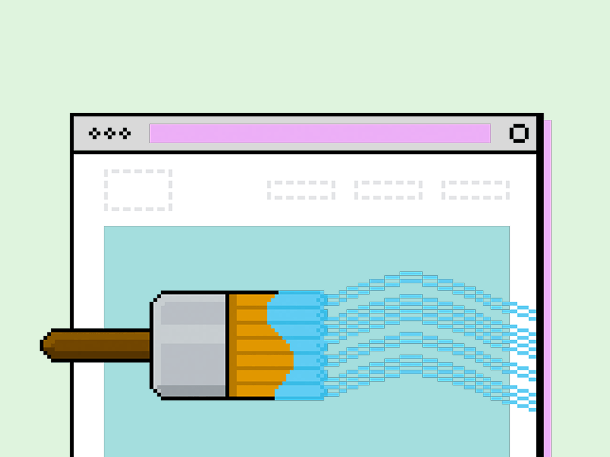
Shopify is changing how merchants manage color across their themes. Color schemes, the grouped sets of background, text, and accent colors that powered most Online Store 2.0 themes, are being phased out in favor of color palettes: a single, global set of named brand colors that merchants pick from anywhere in the theme editor.
If that sounds familiar, it's because it mirrors how design tools like Figma already handle color. Instead of managing several pre-bundled combinations, you define your brand's colors once and reference them everywhere. At Barrel, we see it as a meaningful improvement for how brands design, build, and maintain their sites.
Why the change matters
Color schemes asked designers to think in bundles. Want a light section and a dark section? You needed two full schemes, each with its own background, text, and button colors defined separately. Keeping those schemes consistent with a brand's actual palette meant a lot of manual upkeep, and it was easy for a single updated hex value to fall out of sync across schemes.
Color palettes solve this by flipping the structure. A palette is a global list of two to twenty named colors, defined once in a theme's settings. Brand operators now see them as a simple grid in the editor and choose from that grid whenever they set a color or background anywhere in the theme, whether that's a section, a block, or a global setting. Update a palette color once, and every setting referencing it updates automatically.
This is a more intuitive model for most brands, and it's a lot closer to how designers already think. A brand's palette in Figma is usually a handful of named swatches, primary, accent, text, and so on, not a set of pre-paired combinations. Shopify's move brings theme configuration in line with that mental model.
What this means for building Themes
For anyone building or customizing a Shopify theme, the shift changes a few habits worth knowing:
Name colors by role, not appearance. Keys like primary, accent, and text hold up better over time than blue or dark, since the actual color value can change while the name still makes sense.
Keep the palette small and purposeful. Include only the colors a theme actually needs. Brand operators can always add their own in the editor, so there's no reason to pad the palette with generic options.
Use palette references for defaults. Section and block colors should point back to the palette using the settings.colors syntax, so a single update propagates everywhere instead of requiring changes in multiple places.
Reserve local overrides for genuine exceptions. A color setting with no default lets a merchant deviate from the palette for something specific, like a hero banner's heading color, without disrupting the baseline. This works well alongside a palette: the palette sets the standard, and overrides handle the one-off cases.
Avoid hardcoding colors on anything that needs to meet accessibility contrast requirements. Hardcoded values don't update with the palette and can quietly break contrast ratios as a brand's colors evolve.
With this system, merchants get one place to manage brand color, and developers get a cleaner way to keep every part of a theme consistent with it.
How Barrel approaches color system design
We think about color as part of the broader system that holds a brand's site together, not a set of settings to configure and move on from. When our design team designs or builds a Shopify theme, we define a palette that reflects a brand's identity, name it in a way that will still make sense a year from now, and build every section and block to reference it. That means when a brand refreshes its color palette down the line, whether that's a seasonal update or a full rebrand, the change happens in one place instead of a dozen.
It also means fewer surprises for brand operators. A well-structured palette makes the theme editor easier to use for whoever is managing the site day to day, and it protects against the kind of contrast and accessibility issues that hardcoded colors tend to introduce.
If your theme is still built around the old color scheme model, or if your palette has grown messy over time with values that don't map cleanly to how your brand actually uses color, it's worth a second look. Our design team can help you audit your current setup and rebuild it around a palette that's easier to manage and built to last.
Looking for a redesign of your Shopify site, with a Shopify-ready palette? Email us at newbiz@barrelny.com.