By clicking “Accept”, you agree to the storing of cookies on your device to enhance site navigation, analyze site usage, and assist in our marketing efforts. View our Privacy Policy for more information.
Barrel's Director of Strategy and Design Director hosted a live optimization session deep diving a brand who submitted their site for review, including a roadmap of fixes to implement before BFCM.
When a holiday shopper lands on your product detail page (PDP), they're already interested. But for consumer packaged goods (CPG) brands, whether they buy often depends on how fast the page answers their questions. Is this safe for my allergies? How does it compare to the other options? Do other people like it? If the answers aren't on the page, shoppers go looking elsewhere. During Black Friday Cyber Monday (BFCM), a shopper who leaves your site to research often doesn't come back.
On September 23rd, Barrel's Director of Strategy Val Geisler and Design Director Christine Carforo hosted a live user experience (UX) audit of Momofuku's mobile site, selected from 82 brands who submitted their sites. Their review of the PDP for Momofuku's Chili Crunch became a practical lesson in what CPG product pages should have before peak season. Below, we break down their recommendations and how to apply them to your own PDPs. To see the walkthrough screen by screen, download the free recording of the full audit.
Why the PDP carries so much weight during BFCM
Holiday traffic brings in a wave of first-time shoppers. They don't know your product line, your flavor profiles, or how your product fits into their routine. On mobile, they're scrolling a narrow screen where every section competes for attention. Your PDP has to do the work of a store shelf, a product sample, and a knowledgeable store associate all at once.
Christine summed up the challenge while reviewing Momofuku's product details: "It's really hard to bridge that in-person and online experience." Every recommendation below serves that goal.
Five PDP changes to make before BFCM
01 | Put the full image story at the top of the page
"One thing on the product detail page that we see a lot in heat maps is there's a lot of activity in the thumbnails at the top of the page," Christine said.
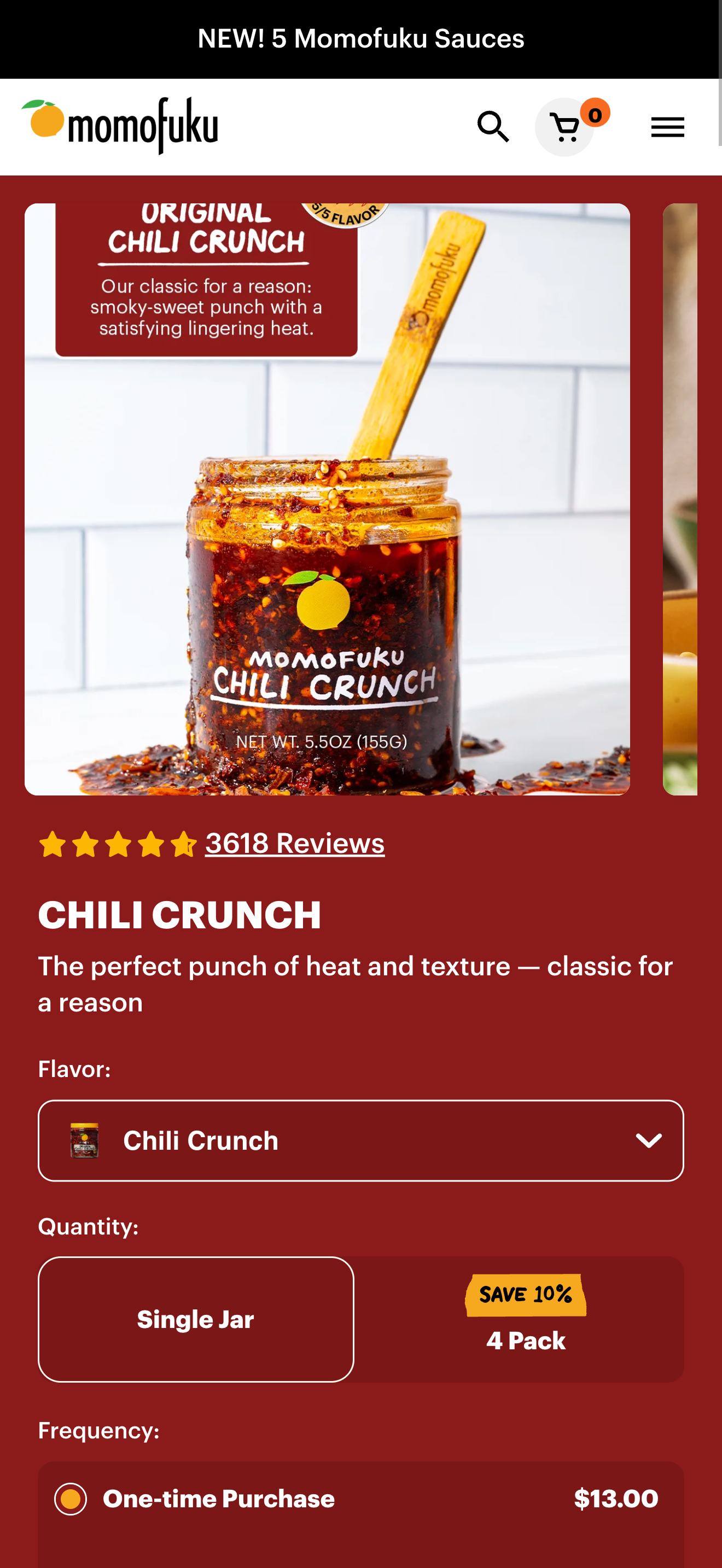
Momofuku Chili Crunch PDP above fold
On Momofuku's mobile PDP, the image thumbnails sit in a carousel that cuts off the cards. Shoppers can't see the range of images available without swiping.
For many CPG shoppers, one image decides whether they can buy at all. "If someone has allergies, and I myself have a lot, I want to see the nutrition label first," Christine said. Missing that information up front can lead to a purchase the customer can't use and a return you have to process.
Christine recommended unpacking the thumbnails below the main image so shoppers can see every option at once. For food and beverage brands, prioritize:
The nutrition label and ingredient list
The product in use, especially for additive products like sauces and seasonings
User-generated content (UGC) recipe images that give shoppers ideas for using the product
"Sometimes that image carousel can tell the whole story of the product," Christine said. Some shoppers only browse this section and never scroll further, so the top of your PDP needs to stand on its own.
02 | Use accordions to answer sensory questions
Momofuku gets this right. Its Chili Crunch PDP uses accordions, collapsible sections shoppers can tap to expand, to explain ingredients, flavor, and ways to eat the product, with recipes further down the page. Accordions keep a mobile page manageable while giving curious shoppers all the detail they want.
Momofuku Chili Crunch PDP accordions
Choose accordion topics based on the questions shoppers ask most. Taste, texture, ingredients, and usage ideas are strong defaults for food and beverage. Beauty and wellness brands might swap in skin type, routine placement, active ingredients, or sourcing.
03 | Build a comparison chart before shoppers go looking for one
Christine noticed Momofuku's PDP had no way to compare products. "My instinct would be to want to compare all the different products against each other," she said, "and I would likely go to ChatGPT or Google to do so if I leave the site." A comparison chart on the PDP keeps that research on your site.
Val connected this to AI search. "The LLMs love comparison charts," she said, referring to the large language models (LLMs) behind tools like ChatGPT. "That's what they want to deliver on their end to the person typing into their chat." Comparison charts are one of the first pieces we recommend in Generative Engine Optimization (GEO) projects. GEO is the practice of structuring content so AI-powered search tools like ChatGPT and Perplexity can accurately find, understand, and cite it.
Val outlined two kinds of comparison charts worth building:
Within your own product line. Compare products by attributes like spice level, core ingredients, or best uses
Against your category. Compare your products with competitors' on the attributes shoppers care about most
"I know it's something that a lot of brands aren't used to creating," Val said. Keep your charts factual and current, use the same attributes across every product, and build them as live text on the page rather than as an image. Text-based charts work for shoppers using screen readers and for AI tools reading your page.
"Rather than giving someone the opportunity to leave and compare, do a product comparison right here." – Christine Carforo
04 | Summarize reviews for shoppers who won't scroll
Momofuku's PDP includes reviews and user-generated content (UGC), both strong signals for new shoppers. Christine recommended adding an AI-generated review summary at the top, a feature most shoppers already know from Amazon and other marketplaces. "People don't have the time or the patience to scroll through all the reviews," she said. "People really just want a gut check that others love this product, and that'll give them the confidence to hopefully make a purchase."
Momofuku Chili Crunch PDP reviews
Keep the full reviews below the summary for shoppers who want to go deeper. Reviews also do double duty for discovery. "Another thing LLMs love are these reviews," Val said. When customers write specific, detailed reviews, AI tools have better material to describe your product with.
05 | Keep the add-to-cart button within reach
Every section you add to the top of your PDP pushes the buy button further down on mobile. Christine noted that Momofuku's subscription benefits take up enough space to push the add-to-cart button lower than it needs to be. Shorter benefits copy keeps the purchase decision in view.
Navigation matters here too. Momofuku's PDP has no breadcrumbs, the small trail of links that shows shoppers where they are on the site. Without them, shoppers have to rely on the browser back button, which can cause problems on mobile. Breadcrumbs give shoppers an easy path back to the collection they came from.
Watch the full session
The full recording covers Momofuku's mobile site from homepage to checkout. In the PDP portion, you'll see:
Christine's walkthrough of the Chili Crunch PDP, including what's working and what we'd change
Why heat maps point to image thumbnails as one of the most-used areas of a PDP
Val's explanation of why comparison charts matter for GEO
How AI review summaries give shoppers confidence faster
Use this to review your top-selling product pages before peak season:
All product images are visible without swiping through a cut-off carousel
The nutrition label or ingredient list appears near the top of the page
Images show the product in use, including UGC where possible
Accordions answer questions about taste, ingredients, and usage
A comparison chart helps shoppers choose within your line
A review summary sits above the full list of reviews
Subscription benefits are short enough to keep add-to-cart high on the page
Breadcrumbs give shoppers a clear path back to the collection
Frequently asked questions
What should a CPG product detail page include?
At minimum, a CPG PDP should include clear product images with nutrition or ingredient information, pricing and purchase options, reviews, and detail on how the product tastes, feels, or works. For BFCM, add a comparison chart and a review summary so shoppers can decide without leaving your site.
Do comparison charts help with AI search?
Yes. LLMs look for structured, comparative content when shoppers ask which product to buy. A clear, text-based comparison chart on your PDP gives AI tools brand-controlled information to cite.
Should we compare our products to competitors' products?
It depends on your category and your confidence in the comparison. Start with a chart comparing products within your own line, which is lower risk and immediately useful. If you add a competitor comparison, keep every claim accurate, specific, and up to date.
Are AI review summaries worth adding before BFCM?
For brands with a healthy volume of reviews, yes. Summaries give new shoppers a fast read on customer sentiment, which matters most during a high-traffic period full of first-time visitors. Check whether your current review platform offers summaries before adding a new tool.
Work with Barrel
Barrel is a commerce agency that works with CPG brands on strategy, design, and performance across every channel. As a Shopify Platinum Partner, we've worked with 300+ CPG brands, including McCormick & Company, Waterloo, KIND, The Outset, and Instant Pot.


.png)
.png)